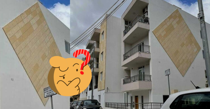
At House.mt, we try to focus our coverage on positive, uplifting design work in Malta, but even to us white-hat wearing writers, it’s hard to ignore this:
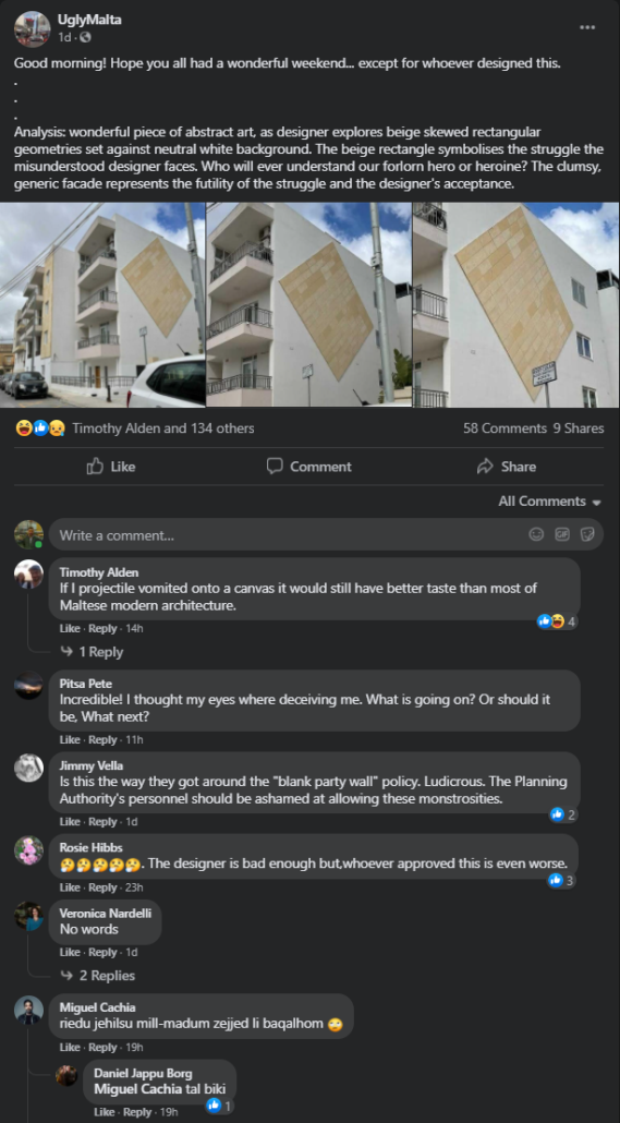
These photos were published on the 15th of March on popular Maltese page dedicated to chronicling local constructions projects with… questionable design.
Original post can be accessed here.
Reactions ranged from complete condemnations to people attempting to remind us that everyone has different tastes. While we do not dispute that we all like different things, there are still a number of rules and principles that, when followed, generally help us create attractive and appealing stuff. When they are not followed, we are left with the above.
The most painful bit about these photos is that we actually *want* and would love to see limestone cladding on our exteriors, but preferably the limestone cladding should be:
i. not be placed at an angle
ii. not be set against a neutral, white background (a beige? a blue? any colour that isn’t white or grey?)
iii. actually cover most or all of the exterior
We’ve dedicated a number of articles to how we can elevate and beautify our streetscapes. Give them a look, and share away with your friend or family – your actions may help prevent design decisions like the one above!
Check out this video on why beautiful things make us happy, and why there *is* a science behind the art.
Have you spotted a new or recent development that, in your opinion, embodies good design?
Speak to us via a comment or a private message, we’re always on the look-out!

