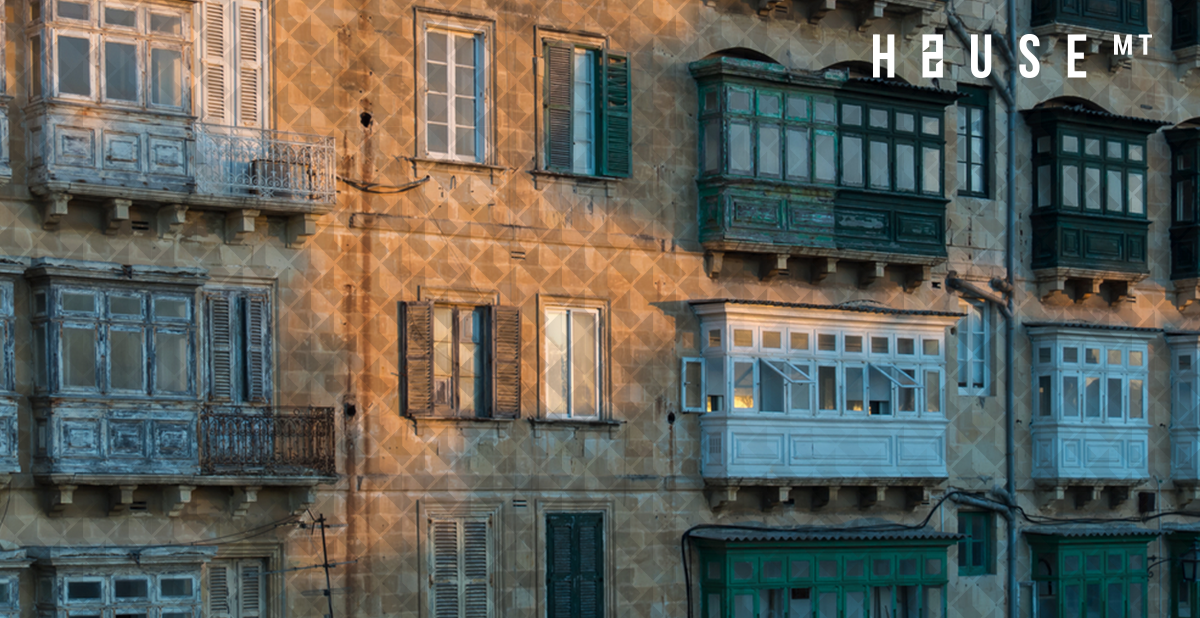
Minimising the expenses of building a block of apartments is a sound business strategy on paper, but if the result is a streetscape that looks disjointed, it won’t take long before tourists and locals alike start turning their eyes away from the area you’ve invested your money on – in a couple of years, the area can mean the town, in a decade, that can mean the island. Yes, efficient and convenient spatial planning is essential, but don’t forget: buyers/clients will see how it looks like from the outside first before getting inside.
If you’ve already read the ideas we put forward in part one, then it’s time for round two. Below are 5 ideas to keep in mind when introducing a new house, apartment block, or hotel to an area:
1. Explore what you can do with colours
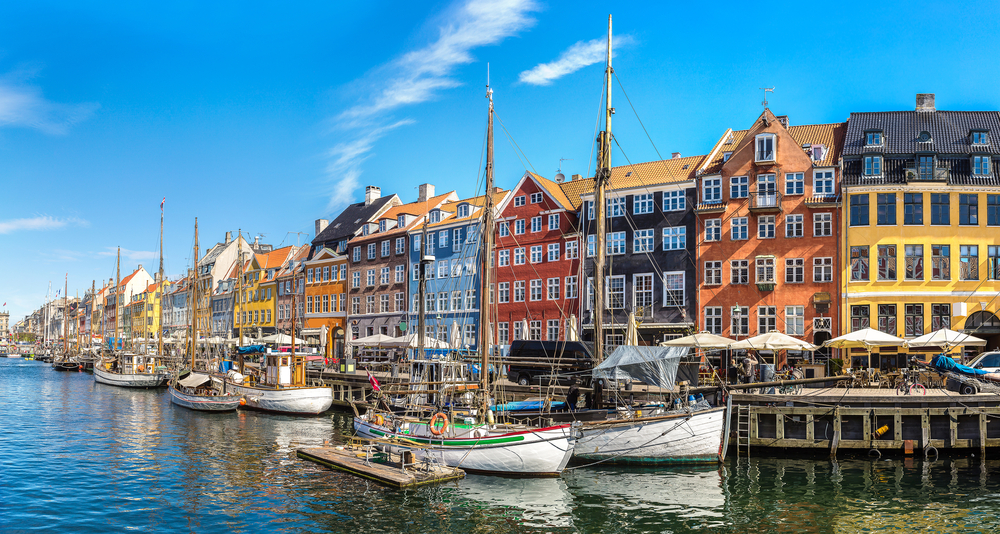
The Planning Authority’s post on using colours with care did not go down too well with its audience, maybe it’s because it felt patronising, or perhaps because it was just tone-deaf. Nevertheless, it does somehow manage to make a good point: choosing the colours for your facade isn’t just your business. Streets are public property, this is why the government can choose to add a bus stop in front of your house; but more importantly, our streets are the spaces that are most easily accessible to us. They’re a couple of steps away from us, literally. We owe it to each other to make them look beautiful and give a good experience to whoever is walking through them.
Due to the scale of a house – which is a naturally sizeable construct – it is a good idea to stay away from highly saturated colours. That doesn’t mean you should opt for neutrals, pastels can create a beautiful exterior. Furthermore, saturated colours are not necessarily a no-go, you can complement a pastel exterior with more saturated frames, borders, or accents. Likewise, no one colour is beautiful or ugly, it is entirely dependent on its context. Our limestone walls certainly favour some colours over others, but the real deal breaker or maker is going to be your neighbours: group up and figure out matching colours to create unity along a street!
Would you like to read more about this? Check out our guide to figuring out a colour scheme for your house’s exterior.
2. Don’t let your Property turn into a Haunted House: Think about Lighting
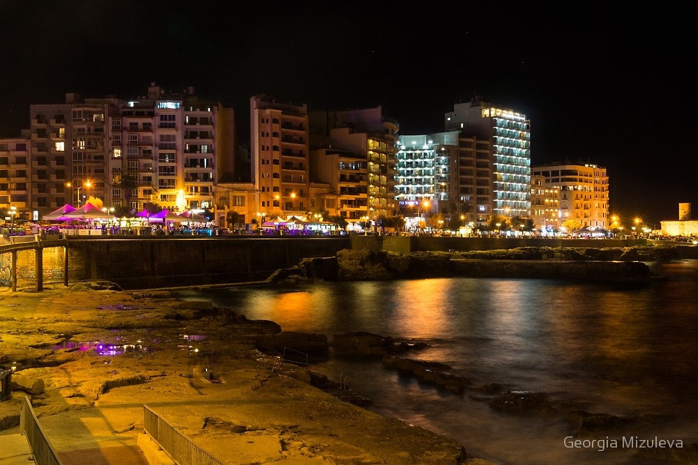
The kind of lighting fixtures you add onto your exterior can completely alter the mood and atmosphere of your building – stay away from fixtures that emit pale blue hospital-like light. If you own a building that spans multiple floors and can be seen in the distance, then make sure it doesn’t look haunted at night – invest in proper light fixtures.
3. Minimalism is meant to be simple, not lonely
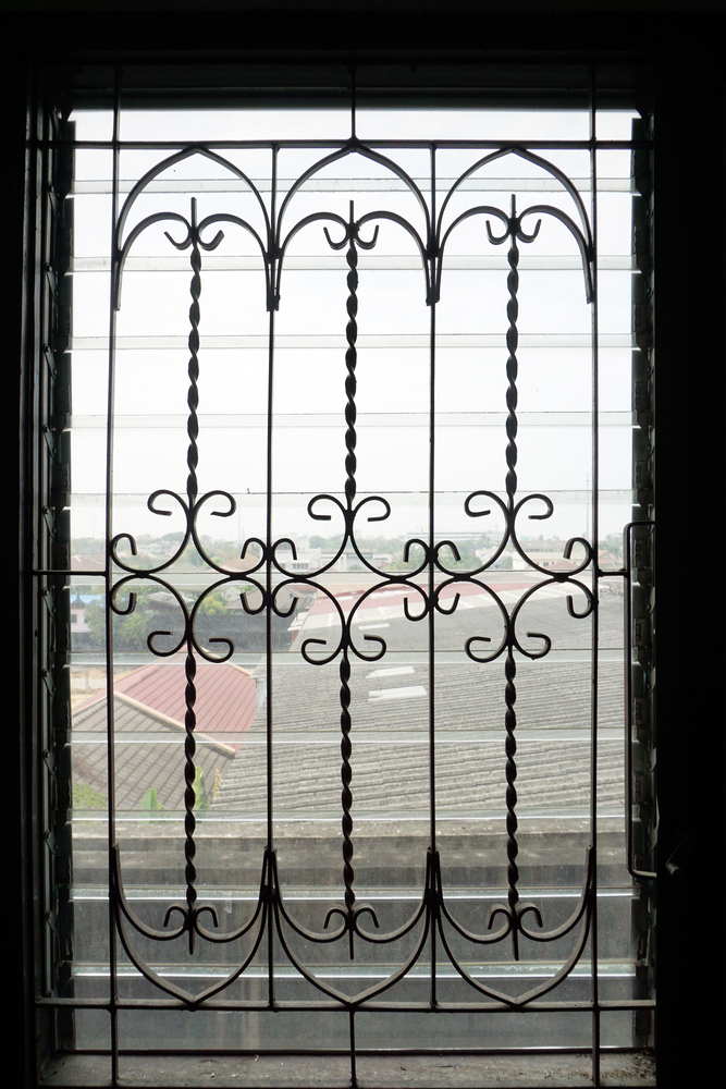
Contemporary exterior designs in Malta, as well as abroad, are designed in a style that’s very minimal, which, when set against Malta’s historical baroque architectural style, can clash sharply. The structural and architectural features on your home may appear too clean and square, even to the point that your design lacks any dimension. Wrought-iron fences can provide the detail and curved features your exterior needs create an overall, dynamic curb appeal for your home.
4. Floor-to-ceiling glasses are great, but they do not belong on every facade
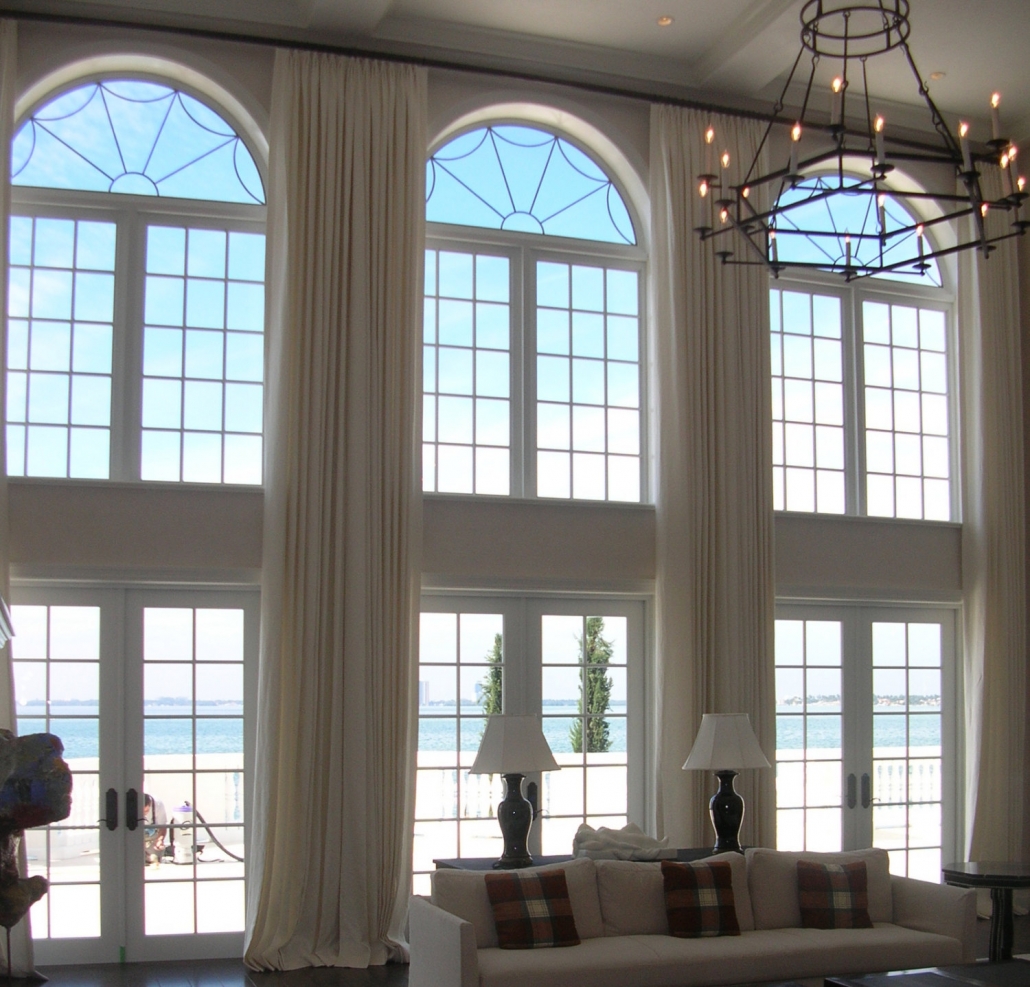
We’re not saying no to giant windows – who doesn’t enjoy waking up with a great view? But every window does not have to be square, encompass the entire facade, or make up the skin of a building. Play with the curves that we have inherited proudly in our designs, and if you want to take things an extra step, surround a building with arches like a second skin. With floor-to-ceiling windows behind arches, you can embrace the trend of floor-to-ceiling glass windows that are prevalent across Malta’s contemporary buildings without making the exterior look too hyper-modern. Arches can be designed to frame views of the surroundings for occupants, as well as to shade the facades from direct sunlight. The arches, in fact, when they extend around the building, fulfill different functions, providing privacy by preventing visibility of the interior from the outside.
5. A good colour that goes with limestone? GREEN.
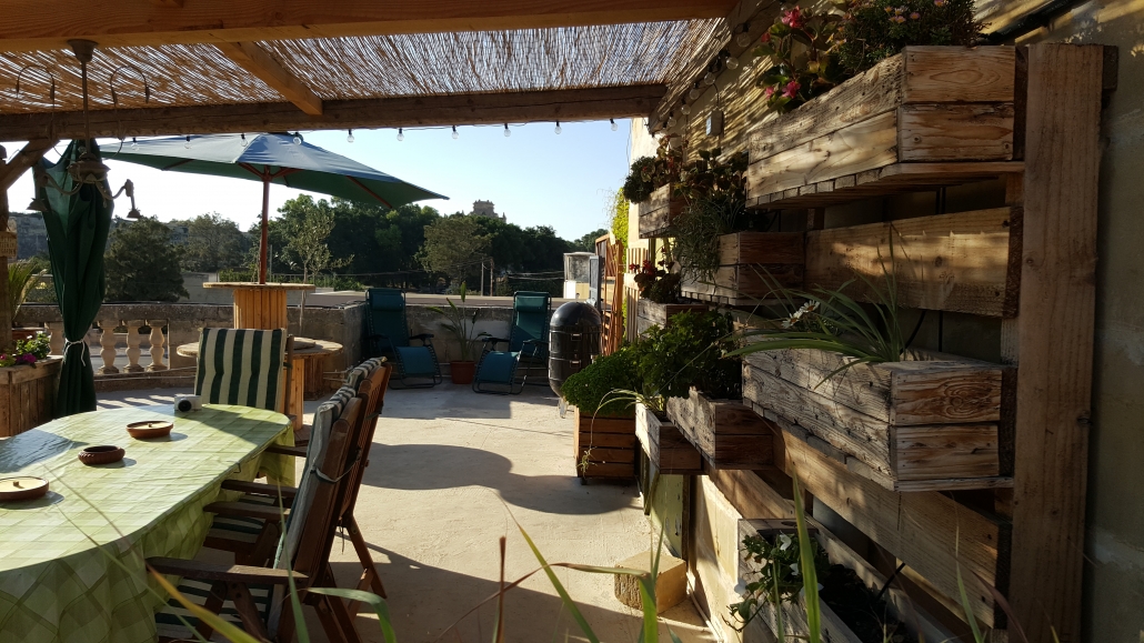
The decline of Malta’s greenery has been lamented to exhaustion in the last couple of years, and it’s not without reason: A frightening amount of ODZ land and green areas have been replaced by concrete squares.
However, with our flat rooftops, and the emergence of new technologies (for example, the creation of vertical gardens) we have the opportunity to use our buildings to green up our streets, both horizontally and vertically.
This also comes with loads of benefits: greening up our rooftops or using high-rises for vertical gardens can drastically improve stormwater management by mitigating runoff and enhancing water quality, decrease energy use, reduce urban heat, increase longevity of roofing membranes, fight noise and air pollution, sequester carbon, increase urban biodiversity by providing habitat for wildlife, provide space for urban agriculture, and result in a more aesthetically pleasing and healthy environment to work and live. This family in Żabbar created a fantastic rooftop garden on a small budget.
Would you like to find out more about turning your rooftop into a garden? Check out this article.

